"If you don't document it, it doesn't exist"
디자인 시스템 관련한 문장 중에 가장 와닿는 말이다.
문서화를 하지 않으면, 디자인 시스템을 사용할 수 없다. 아무리 재사용 쉬운 컴포넌트를 만들어도, 주석을 예쁘게 달아놔도 문서화가 되어있지 않다면 그건 디자인 시스템이라고 부를 수 없는 것이다.
이처럼 시스템을 구축할 때 가장 중요한 부분 중에 하나는 "문서화"라고 생각한다. 문서화를 통해 모든 내부 인원이 시스템에 대한 동기화를 할 수 있기 때문이다.
그 문서화를 Storybook을 통해 이룰 수 있다. 스토리북은 쉽게 배포가 가능한데, 몇가지 명령어만 설정해놓으면 디자이너와 개발자가 참고하는 하나의 동기화된 library를 갖게되고, 더이상 이미 만들어 놓은 UI를 찾는데 시간을 쓰거나, 다시 만드는 비효율성을 발생시키지 않게된다.
Storybook v5.2 부터 MDX 지원하기 때문에 상당히 편리하게 사용할 수 있다.
그리고 다양한 애드온을 제공함으로써 UI 개발에 도움이 되는 여러가지 기능을 갖추고 있다. UI 문서화 도구로 인지도와 사용률 측면에서 스토리북이 매우 월등한 편이다.
Storybook 시작
스토리북 설치하기
스토리북을 통해 디자인 시스템을 구축하는 방법을 학습해보자!
기본적인 스토리(story) 작성이나 설정 파일 수정 등 스토리북(Storybook)의 기본 사용법에 대한 사전 이해가 필요할 수도 있다.(스토리북 소개 참고).
스토리북에서 디자인 시스템을 위한 개발자 가이드를 참고하자. -> https://storybook.js.org/tutorials/design-systems-for-developers
여기서 제공하는 템플릿으로 구축을 시작해보자.
# Clone the files

npx degit chromaui/learnstorybook-design-system-template learnstorybook-design-system

cd learnstorybook-design-system

# Install the dependencies

npm install
폴더 구조 설계하기
해당 템플릿은 js로 되어있는데 ts로 변경하는 부분은 생략하겠다.
디렉토리 구조를 확인해보면, src/ 하위에 Avatar, Badge, Button 등이 있다.
.jsx 파일과 .stories 파일이 들어있는데 각각 components와 stories 폴더로 나눠서 다음과 같이 폴더구조를 관리하도록 했다.
stories 폴더에는 DesignToken과 Atoms 컴포넌트로 나눠서 디자인 시스템을 문서화했다.
src
ㄴhooks
ㄴassets
ㄴcomponents
  ㄴAvatar
  ㄴBadge
  ㄴButton
ㄴstories
  ㄴDesignToken
  	ㄴcolors
  	ㄴsemantic
    ㄴtypography
    ㄴgrid
  ㄴAtoms
    ㄴAvatar
  	ㄴButton
    ㄴBadge
ㄴstyles
  ㄴGlobalStyle
  ㄴTheme
  ㄴstyle.d.ts
ㄴindex.tsx
ㄴPovProvider.tsx
Theme 정의하기
styles/Theme.ts에 프로젝트 내에서 사용할 테마 및 스타일 데이터를 정의한다.
const color = {
    /** Black & White **/
    black: 'black',
    white: 'white',
    /** Gray */
    gray800: '#333036',
    gray700: '#28262B',
    ...생략

    red: '#F74F3B',
    blue: "#00C3FF",
    yellow: "#FFEB00",

  } as const;

const typography = {
  heading01: {
    fontSize: '2.4rem',
    lineHeight: '120%',
    fontWeight: 700,
  },
  heading02: {
      fontSize: '2.0rem',
      lineHeight: '120%',
      fontWeight: 700,
  },
  ... 생략
  paragraph: {
    fontSize: '1.6rem',
    lineHeight: '160%',
    fontWeight: 400,
  },
  badge: {
    fontSize: '1.2rem',
    lineHeight: '100%',
    fontWeight: 700,
  }
} as const;-
시멘틱 컬러는 다크 모드와 라이트 모드 시 동일한 변수로 시멘틱 컬러를 정의하여 테마 모드에 따라 색상이 적용되도록 했다.
const darkTheme = { // 다크 모드시 스타일
background: '#333036',
backgroundElevated: '#4C494E',
primary: '#FFFFFF',
secondary: '#E5E5E5',
teritary: '#ADACAF',
muted: '#858386',
faint: '#676668',
}

const lightTheme = { // 라이트 모드시 스타일
background: '#F5F5F5',
backgroundElevated: '#FFFFFF',
primary: '#333036',
secondary: '#676668',
teritary: '#ADACAF',
muted: '#C9C9CA',
faint: '#E5E5E5',
}

export const themes: { light: ThemeType; dark: ThemeType } = {
  light: lightTheme,
  dark: darkTheme,
};
또한, 타입 스크립트를 사용하고 있으므로 theme에 대한 타입을 지정해야한다.
Theme.ts 에서 설정한 theme 객체와 동일한 구조의 type을 src/styles/style.d.ts 파일에서 선언해주어야 한다.
interface TextStyle {
  [key: string]: {
    fontSize: string;
    lineHeight: string;
    fontWeight: number;
  };
}

declare module '@emotion/react' {
  export interface Theme {
    background: string;
    backgroundElevated: string;
    primary: string,
    secondary: string,
    teritary: string,
    muted: string,
    faint: string,
    textElevated: string;
    color: { [key: string]: string };
    typography: TextStyle;
    spacer: { [key: string]: string };
    borderRadius: { [key: string]: string };
    boxShadow: { [key: string]: string };
  }
}
Theme 적용하기
App 최상위에 PovProvider.tsx 파일을 만들어서 ThemeProvider 를 추가하면 내부 Context를 통해 하위 컴포넌트들이 테마에 접근할 수 있도록 해준다.
emotion.js에서는 css prop을 통해 접근할 수 있다.따라서 @emotion/react 가 제공해주는 ThemeProvider를 import 한 후, App Component를 감싸준다. 그리고 아까 만든 theme 객체를 전달해준다.
import { Global, ThemeProvider } from '@emotion/react';
import type { PropsWithChildren } from 'react';

import { GlobalStyle } from '@styles/GlobalStyle';
import { Theme } from '@styles/Theme';

type PovProviderProps = PropsWithChildren;

const PovProvider = ({ children }: PovProviderProps) => (
  <ThemeProvider theme={Theme}>
    <Global styles={GlobalStyle} />
    {children}
  </ThemeProvider>
);

export default PovProvider;
재사용될 컴포넌트 통합
재사용 가능한 컴포넌트를 만든다고 생각해봤을 때, 각 컴포넌트마다 어느 props를 전달받고 어느정도의 자유도를 줄 지를 결정해야 한다.
디자이너가 사이즈나 속성을 만든대로 구현한다고 생각했을 때, 이를 적절히 코드로 옮겨야한다.
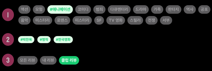
위의 경우는 페이지 곳곳에서 쓰이는 Badge 형태의 컴포넌트를 모아둔 것이다.
회원가입할 때, 리뷰 작성할 때, 영화 키워드 노출할 때 등 키워드 관련된 Badge가 사용된다. 또 리뷰 페이지에서 각 영역 관련된 Badge가 사용된다.
이러한 Badge를 공통 컴포넌트로 뽑아서 어떤 속성을 줄지 생각해봤을 때, 쓰임에 따라 variant를 keyword와 section으로 나누고 click 속성을 줘서 적절하게 컴포넌트를 사용할 수 있도록 했다.
emotion으로 컴포넌트 스타일링 하기
컴포넌트를 스타일링하기 위해 일반 css 파일을 작성해도 되긴 하지만, 대신에 emotion 이라는 CSS-in-JS 라이브러리를 사용하는 것을 권장한다. 그 이유는, 나중에 라이브러리를 배포하게 될 때 css-loader 쪽에 대해서 신경 쓸 필요 없고, 라이브러리를 사용하게 될 때에도 css를 불러오는 것에 대해서 신경쓰지 않아도 되기 때문이다.
variant에 따라 스타일을 나눠서 구현했다. 그리고 사이즈까지 props로 지정해줄 수 있도록 했다.
src/components/Badge/Badge.style.ts
import { css, SerializedStyles } from '@emotion/react';
import { useTheme } from '../../PovProvider'; // 테마 훅 가져오기

export const getVariantStyling = (variant: 'keyword' | 'section', isActive: boolean) => {
 const { theme } = useTheme(); // 테마 가져오기

 const style: { [key in 'keyword' | 'section']: SerializedStyles } = {
   keyword: css({
     backgroundColor: isActive ? theme.color.green100 : theme.faint,
     color: isActive ? theme.color.green600 : theme.teritary,
     borderRadius: theme.borderRadius.large,
   }),
   section: css({
     backgroundColor: isActive ? theme.color.green600 : theme.faint,
     color: isActive ? theme.color.green100 : theme.teritary,
     borderRadius: theme.borderRadius.large,
   }),
 };

 return style[variant] || css({});
};

export const getSizeStyling = (size: 'small' | 'large') => {
 const { theme } = useTheme(); // 테마 가져오기
 const style = {
   large: css({
     padding: `10px 12px`,
     fontSize: theme.typography.heading05.fontSize,
     lineHeight: theme.typography.heading05.lineHeight,
     fontWeight: theme.typography.heading05.fontWeight,
   }),
   small: css({
     padding: `6px 8px`,
     fontSize: theme.typography.badge.fontSize,
     lineHeight: theme.typography.badge.lineHeight,
     fontWeight: theme.typography.badge.fontWeight,
   }),
 };

 return style[size];
};
variant에 따라서 컴포넌트 렌더링하기
그리고 키워드 관련된 Badge는 앞단에 # 을 붙여야하기 때문에 click과 cancel 속성을 나눠서 조건부 렌더링을 진행하도록 했다.
src/components/Badge/Badge.tsx
export interface BadgeProps extends ComponentPropsWithoutRef<'span'> {
variant: 'keyword' | 'section';
size?: 'small' | 'large';
cancel?: boolean;
click?: boolean;
}
const Badge = ({ variant, size = 'small', cancel = false, click = false, children, ...attributes }: BadgeProps) => {
const isActive = variant === 'keyword' ? cancel : click;
// children 값 확인 및 안전한 처리
if (typeof children !== 'string' && typeof children !== 'number' && !React.isValidElement(children)) {
console.error('Invalid children passed to Badge:', children);
return null; // 잘못된 children이 전달되었을 경우 null 반환
}
return (
<span css={[badgeStyling, getVariantStyling(variant, isActive), getSizeStyling(size)]} {...attributes}>
{variant === 'keyword' && isActive ? (
<>
<span style={{ marginLeft: '4px' }}># </span>
{children}
</>
) : (
children
)}
</span>
);
};
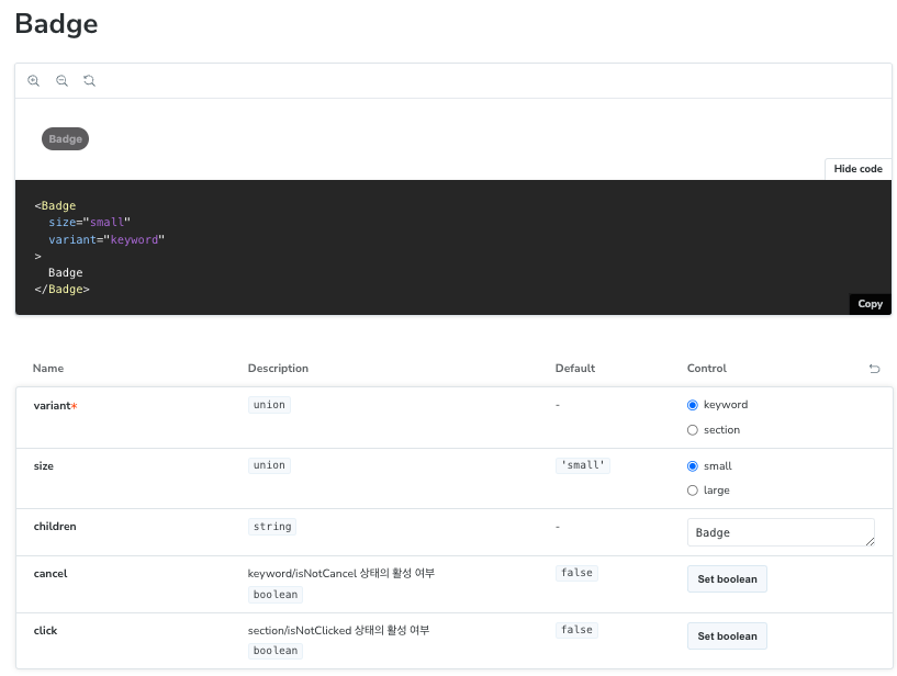
export default Badge;스토리 정의하기
컴포넌트를 다 작성했으면, 스토리들도 새로 정의한다.
src/stories/Atoms/Badge.stories.ts
import { containerStyle, informationStyle } from './styles';
import Badge from '../../components/Badge/Badge';
import type { Meta, StoryObj } from '@storybook/react';

const meta = {
  title: 'Design System/Badge',
  component: Badge,
  argTypes: {
    variant: {
      control: { type: 'radio' },
      options: ['keyword', 'section'],
    },
    size: {
      control: { type: 'radio' },
      options: ['small', 'large'],
    },
    cancel: {
      control: { type: 'boolean' },
      description: 'keyword/isNotCancel 상태의 활성 여부',
    },
    click: {
      control: { type: 'boolean' },
      description: 'section/isNotClicked 상태의 활성 여부',
    },
  },
  args: {
    variant: 'keyword',
    size: 'small',
    children: 'Badge',
  },
} satisfies Meta<typeof Badge>;

export default meta;
type Story = StoryObj<typeof meta>;

export const Playground: Story = {};

export const Variants: Story = {
  render: ({ children }) => (
    <ul css={containerStyle}>
      <li css={informationStyle}>
        <h6>keyword</h6>
        <Badge variant="keyword" cancel={true}>
          {children}
        </Badge>
        <Badge variant="keyword" cancel={false}>
          {children}
        </Badge>
      </li>
      <li css={informationStyle}>
        <h6>section</h6>
        <Badge variant="section" click={true}>
          {children}
        </Badge>
        <Badge variant="section" click={false}>
          {children}
        </Badge>
      </li>
    </ul>
  ),
};

export const Sizes: Story = {
  render: ({ variant, children }) => (
    <ul css={containerStyle}>
      <li css={informationStyle}>
        <h6>Small</h6>
        <Badge variant={variant} size="small">
          {children}
        </Badge>
      </li>
      <li css={informationStyle}>
        <h6>Large</h6>
        <Badge variant={variant} size="large">
          {children}
        </Badge>
      </li>
    </ul>
  ),
  argTypes: {
    size: {
      control: false,
    },
  },
};

export const keyword: Story = {
  args: {
    variant: 'keyword',
  },
  argTypes: {
    variant: {
      control: false,
    },
  },
};

export const section: Story = {
  args: {
    variant: 'section',
  },
  argTypes: {
    variant: {
      control: false,
    },
  },
};
스토리를 다 만들고나면 다음과 같이 여러 variant을 가진 Badge들이 보여질 것이다.
이렇게 모든 컴포넌트에 어떻게 쓰일지 충분히 고려해서 만들었고 새로운 곳에 Badge를 만든다면 variant로 props를 추가해주면 된다 !
필요에 따라 적절한 작업을 해주게 된다면 확장을 하는데 큰 어려움이 없을 것이다.
물론 한번에 컴포넌트가 완벽하게 정착이 안될 수도 있다. 위의 Badge의 경우도 UI 디자인에서 몇번 바뀐 시안이었기 때문에 그 과정에서 몇차례 수정 작업이 있었다. 이러한 부분은 개발자의 공수가 더 들어가지만, 결과적으로는 이런식으로 컴포넌트를 구축해두면 예쁘게 손쉽게 가져다쓸 수 있는 것이 아주 큰 장점으로 작용했고 필요한 작업이었다는 생각이 든다.
이렇게 커스텀한 디자인을 팀원 모두가 잘 사용할 때 큰 뿌듯함을 느꼈다!